My parents are in their later seventies. They remember when everything was done by pen and paper and there are times when they wish that would still be the case today.
They have an endless amount of forms to fill out- the bank, insurance, health statements and on and on. Of course companies put all of these forms online for “the customers convenience” but sometimes these forms are anything but convenient.
The forms can be long and difficult to figure out. You can’t always type in the PDF, even though at the top it says you can. (I see you grant writers, I see you.) It can be a very frustrating experience.
Last week I had to help my father with one such form. The form wasn’t user friendly. I had to step in and play tech customer service.
Know who else has a lot of online forms? Your nonprofit.
Wanna maximize submissions? Let’s dive into this week’s pain point, losing potential connection opportunities.
More conversions, less frustration
Only 15% of people who clicked thru (from an email) to an online donation form submitted a gift (2024 M+R Benchmarks Study).
For every 100 people who received your fundraising campaign email, only 15 will actually
- click the link in the email
- fill in the donation form and
- submit it (conversion).
That’s a lot of people not converting! But they did click thru to your online donation form. What stopped them from filling in the form and donating?
Think about all the potential forms you could have on your website: Event registration, volunteer sign up, email subscribe, donation form, download an ebook and more. Plenty of opportunities for you to connect with users. But if the forms aren’t user friendly you’re squandering that opp.
Too many organizations are collecting information just to have it, gathering data that’s dumped into the database and then collects cyber dust.
For example, I know of a nonprofit whose online email subscribe form contains THIRTEEN required fields! It’s a long form and it’s almost as if they don’t want people to sign up for their enews.
Look at your online forms: If you’re asking for all the info, including Zoom ID and blood type, time to edit and fix.
When I perform audits of online donation forms I have more than 50 different criteria I’m looking at. You better believe that list includes unnecessary fields!
Conversions are dependent on design, easy navigability, ease of use and form length. Yes, some forms like volunteer signups can be on the longish side- you need to know what days and times people are available, what volunteer opps they’re interested in, past experience etc.
But if you’re offering someone who just adopted a pet from your shelter the opportunity to download your ebook “10 ways to keep your new dog healthy,” you shouldn’t be asking for more than first name and email in the download form.
Additionally, the average donor is over the age of sixty. Think about THEIR needs and how important large font size, clear instructions and ease of use are to them.
Let’s talk about forms and user experience for a minute.
You CAN raise your forms conversion rate. More people submitting = more chances for building the relationship which can = higher donor retention.
How to calculate conversion rate: The number of people who converted divided by the number of visitors to that specific landing page x 100.
What can you do to raise the conversion rates of your forms?
- Yay or nay?: Review each field in every form and determine if you really need it or not. No? Delete those fields. Less info to submit makes users happy.
- Test: When’s the last time you filled in and submitted your forms? If it’s been awhile, do it today. See how easy (or difficult) it is to fill in the form. When I work with clients I always test out their online forms. If it’s a pain to fill out, we work on fixing the problem.
- Outside eyes: It’s not enough for you to test. Ask people of different ages outside your organization to test your forms. Ask some to fill it out on their desktop and some on mobile. This process will provide you with insights and pain points to fix that will help raise your conversion rates.
- Mobile: With over 50% of people reading emails on their phone, a decent part of your audience will be filling out your forms on their phone. Make sure your forms are mobile responsive.
- General form tips:
- Make error messages helpful
- Large font size
- Make sure there are clear breaks between sections
- Plenty of whitespace in between fields
- Remove the upper menu from the landing page so there’s nothing to distract the user from filling out the form
- If it’s a long form, use a progress bar so people know how much they have left
- Labels for fields should be on top of the field box, not to the left of the box
- Clearly label which fields are required
Your online forms are some of the most important property you own. Make sure they’re converting way above average!
Form bonus 1: Watch this short video to learn where to place the email subscription form on your website.
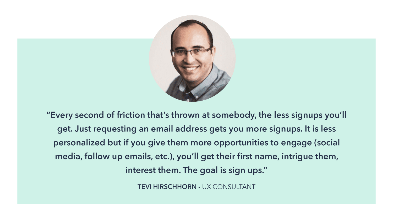
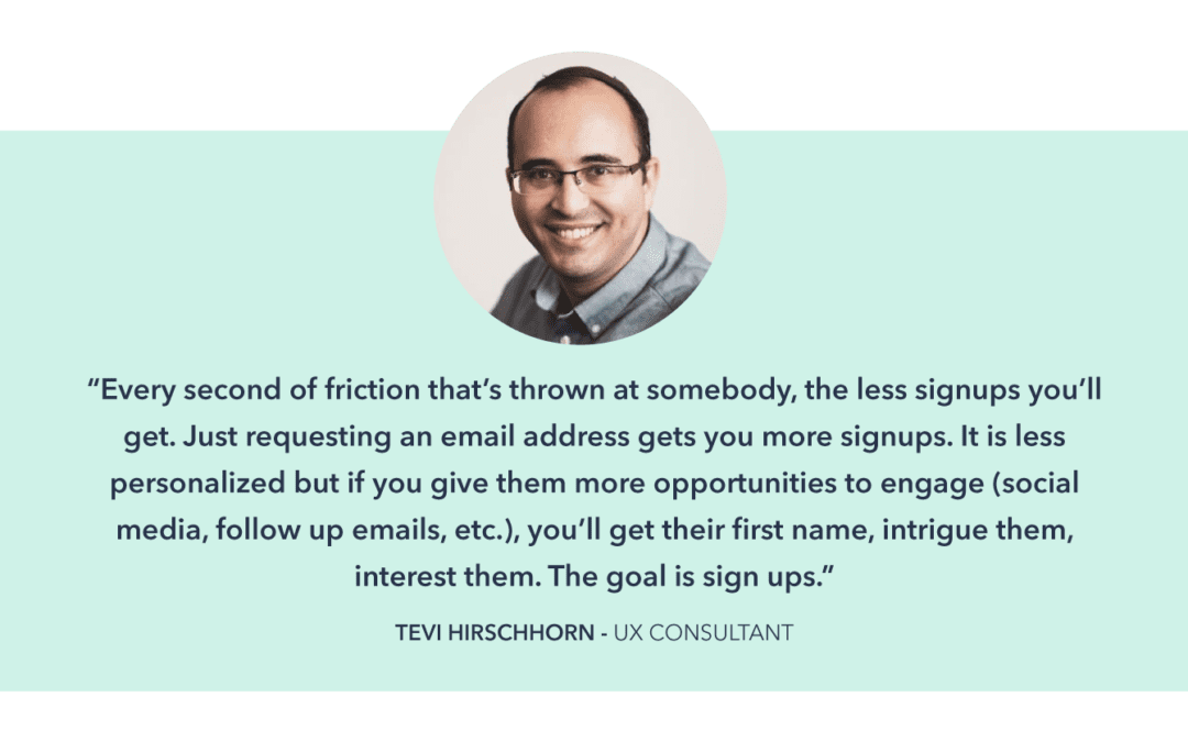
Form bonus 2: How many fields should your enews subscription form have? I’ll let an expert answer that:

You want to limit friction on all online forms. Don’t ask for more than you need!
Form bonus 3: Should your online donation form include a checkbox to allow people to subscribe to your enews?
YES!
A donation is not the end of the road. You want to continue the relationship. One way to do that is to encourage more people to subscribe to your enews.
Form bonus 4: Should your form checkboxes be opt in (user has to check the box) or opt out (pre-checked)? It’s complicated.


